Digipak

All posts tagged Digipak

Promotional Advert – First Draft

Published February 6, 2014 by coopersmedia

advert

Here is a first draft of our potential advertisement. We want the picture to be in either the left or right third to allow room for the text down one side as we feel this will create a nice balance. We want our artist to be posed looking away from the camera with a slight smile as a mid-shot. We intend to use our logo as featured on our digipak incorporated with our artist’s name in a crimson colour font, matching with our artist’s outfit in the music video and digipak colour scheme. We intend to keep the text font the same as our digipak for continuity. A main convention of music adverts is reviews and so we have decided to use two genre specific reviews to promote our artist and their album. We will also include tangeable links to other music platforms such as iTunes where the album can be downloaded. From research into the current music industry, iTunes is the most popular way of downloading music and thus feel this will be suitable for our album. As our artist is internationally famous, we feel that by converging with social media networks such as Facebook, this will help to promote our artist whilst providing “extras” for her fan base / target audience.

Research Into The Links Between Digipaks and Advertisements

Published February 5, 2014 by coopersmedia

I have conducted some research into the similarities between digipaks and adverts for female artists. Whilst some of the research is genre-specific e.g. Ellie Goulding and Florence and the Machine, I also looked at artists from other genres to gain a broader sense of the expectations from both promotional materials e.g. Katy Perry – Pop.

Conventions of an Advert

Published February 5, 2014 by coopersmedia

Today in class we started to look at possible ideas for our advert. We recognise there must be clear links between our video, digipak and advert and we intend to portray these elements of continuity through aspects such as consistenecy with regards to the colour scheme and font. When looking at some existing digipaks and adverts, we quickly realised the two products were very similar, often using the same or similar image as on the digipak. We then analysed these digipaks and adverts and produced a list of certain conventions within the adverts.

1. Genre specific reviews
2. Synergy between advert and digipak
3. Inclusion of record label / website / logo
4. Name of the artist / album
5. Tangeable links to other platforms e.g. iTunes
6. Colour scheme parallel to the digipak
7. Striking image
8. Balance of images and text

Below are some of the digipak / adverts we analysed in order to gain inspiration:

This slideshow requires JavaScript.

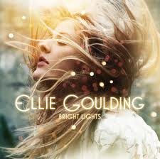
Here is the Ellie Goulding Digipak / Advert which we have taken inspiration from, particularly using the lights consistently throughout each product.

ellie goulding 2

ellie goulding

DigiPak – Final Design

Published January 31, 2014 by coopersmedia

Front Cover:

Single Digi pack pane FRONT COVER

Middle Panes:

Digi pack middle pane

Back Cover:

Single Digi pack pane BACK COVER<a

This is the final design of our DigiPak. We have used photoshop in a variety of ways in order to create a style that would fit both our artist and our chosen genre. Our main theme running throughout out DigiPak is the idea of the fairy lights we used outside. When we were taking the picture for our Digipak, we decided to take the pictures of the lights so they were out of focus to give a softer feel to our album covers and avoid distracting the attention from the written information and the artist herself. In terms of the cokour scheme, we decided that we would use the colour of the shirt she wears in the party scenes of the music video to reinforce continuity and ensure this reflected our artists personality.